CARBON
레스토랑 카본
CLIENT : CARBON
YEAR : 2025.11.
Art Direction : ART PPL(creations)
Branding : ART PPL(creations)
Graphic Identity : ART PPL(creations)
Artwork Development : ART PPL(creations)
Spatial Visual Direction (in collaboration) : ART PPL(creations)
Artworks : ART PPL(creations)
생명의 원소이자 불을 상징하는 ‘숯(Carbon)’에서 출발한 CARBON은 바다의 역동성과 도시의 세련미가 교차하는 해산물 다이닝입니다. 거칠고 투박한 피쉬 마켓의 감성을 차콜과 블루 톤의 디자인 언어로 재해석해 현대적인 미감으로 완성했습니다.
특히 ‘No Oyster Zone’을 선언하며 씨푸드 다이닝의 전형성을 탈피했습니다. 굴이 차지하던 자리를 차콜 오븐의 강렬한 불꽃과 다채로운 해산물의 풍미로 채워, 화이트 와인과 감각적인 사운드가 흐르는 도회적인 미식 경험을 제안합니다.
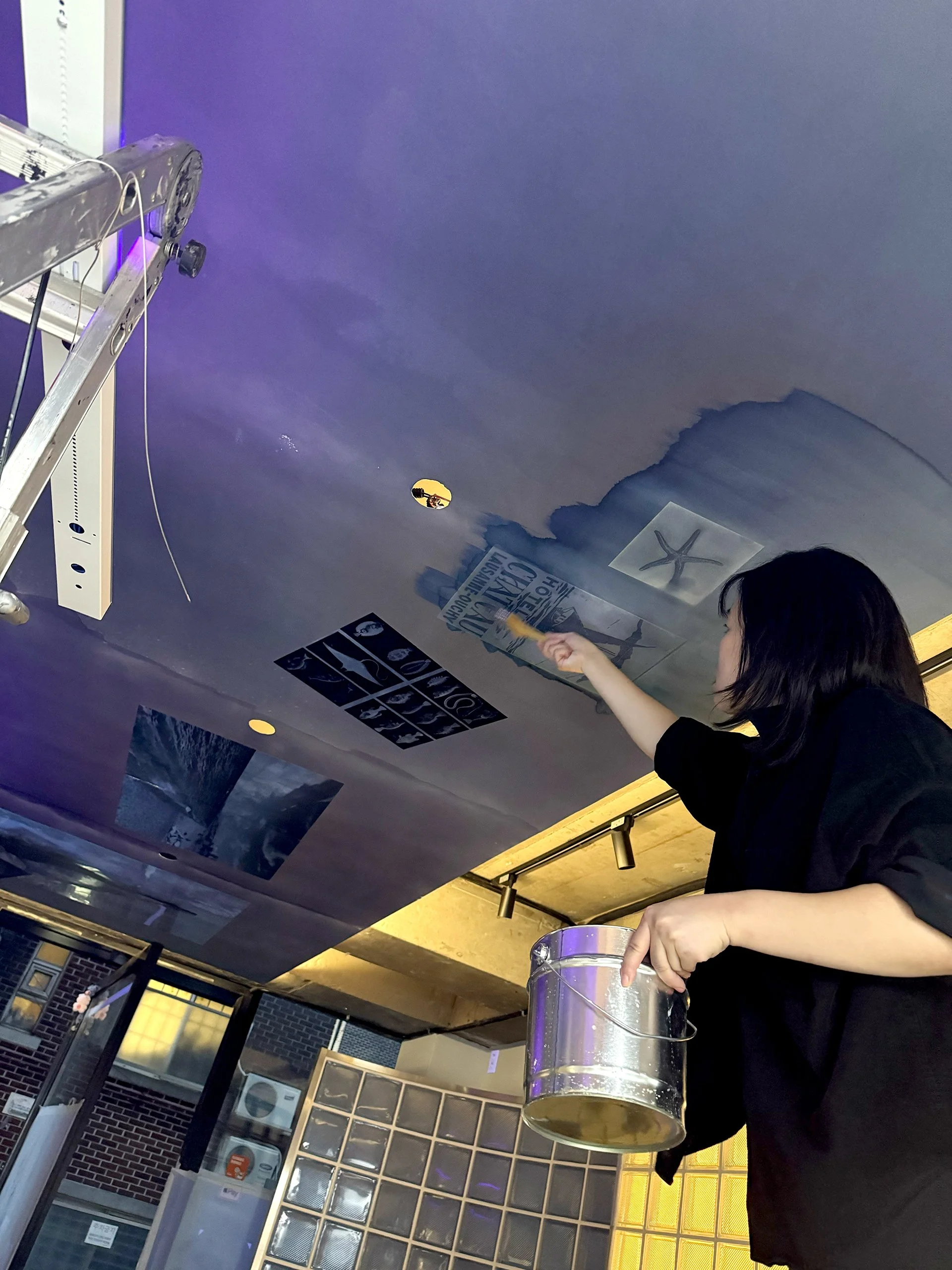
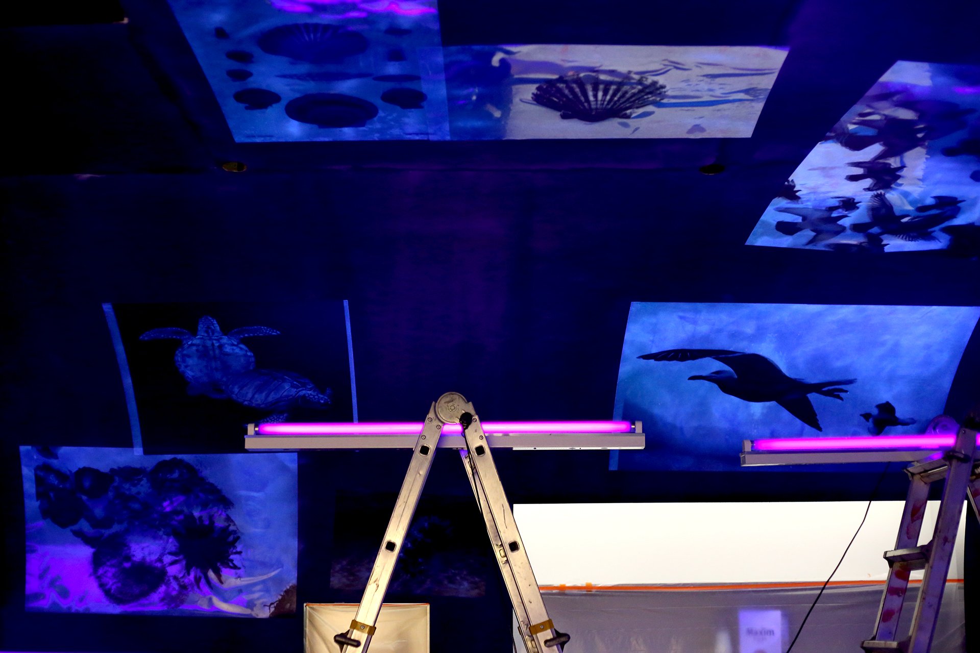
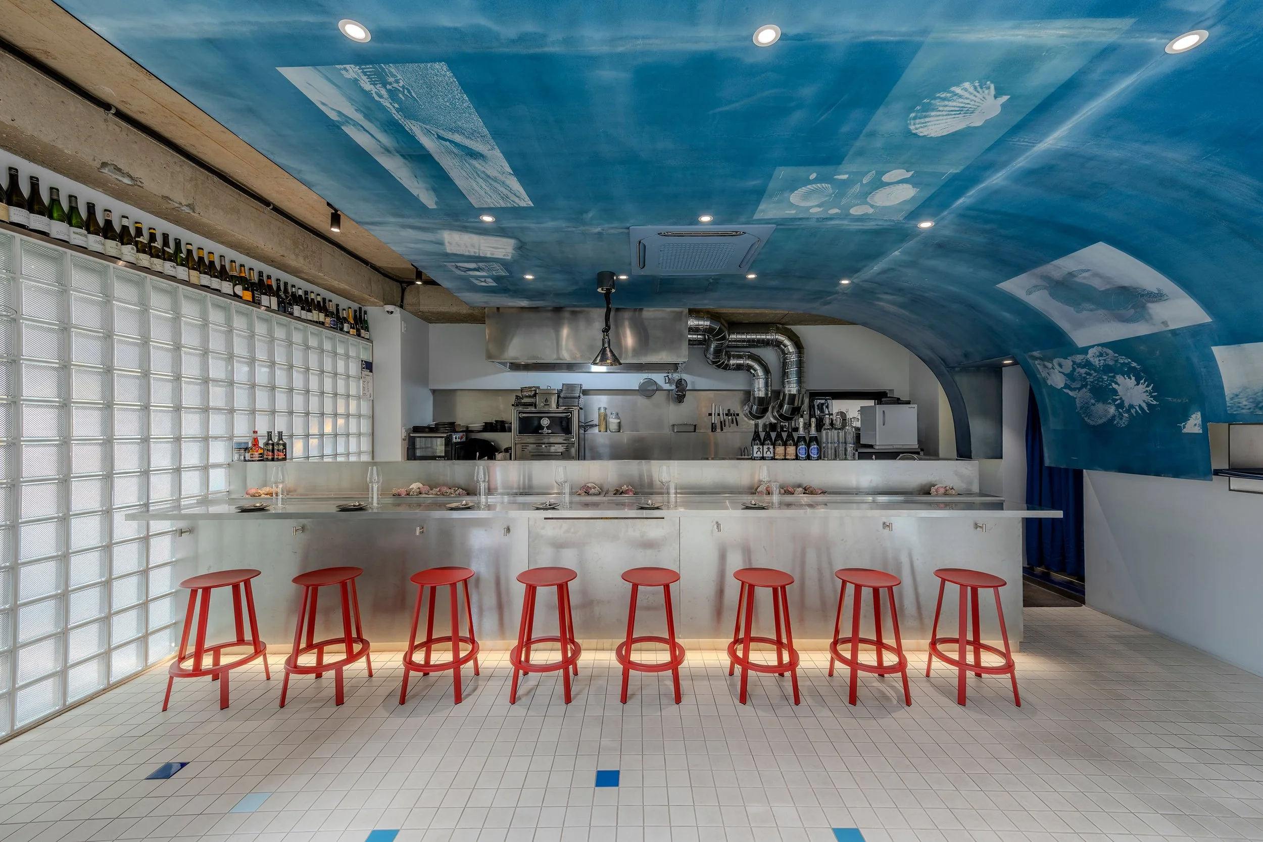
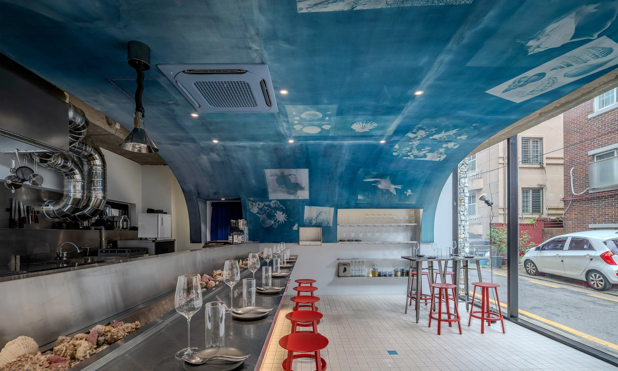
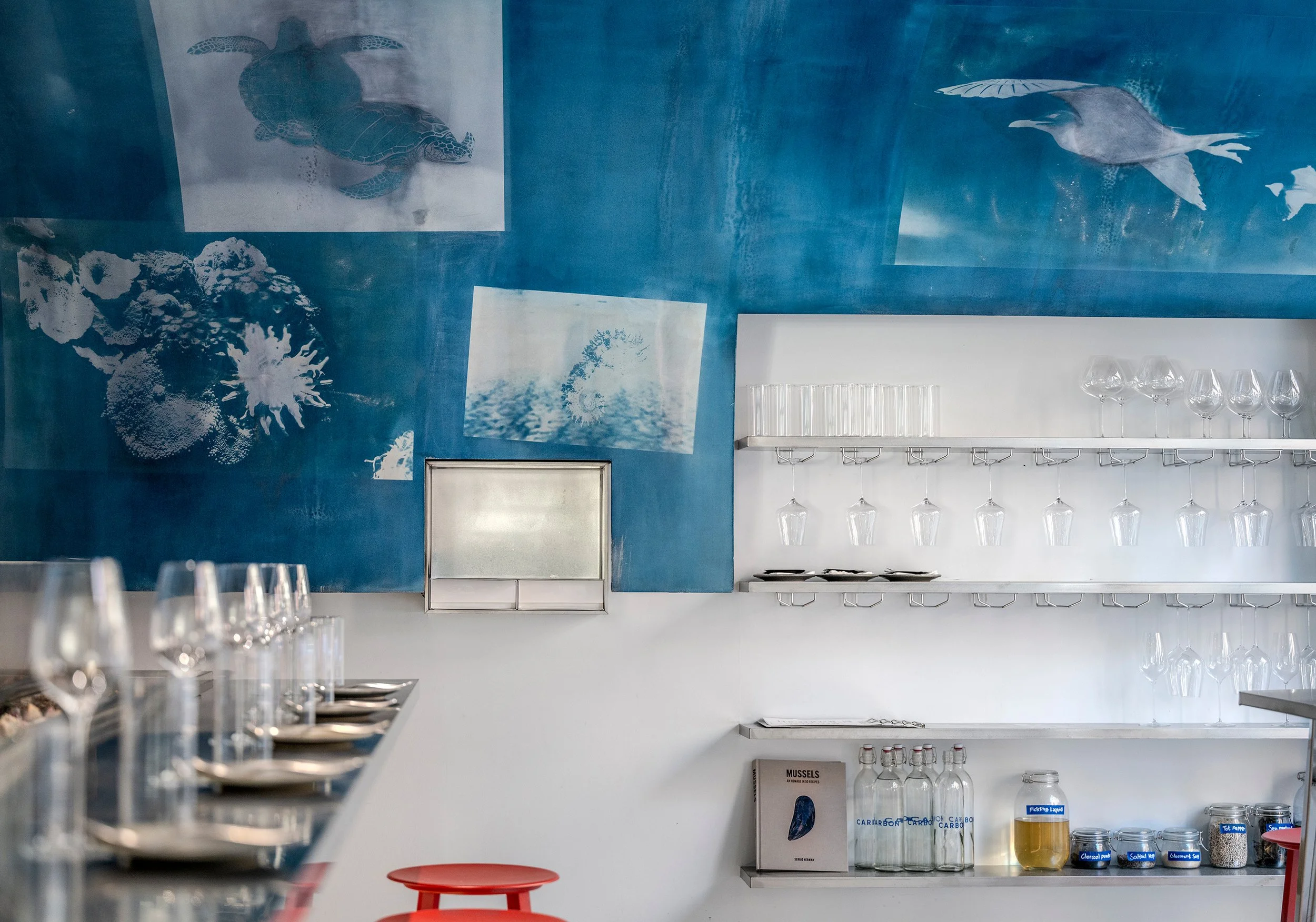
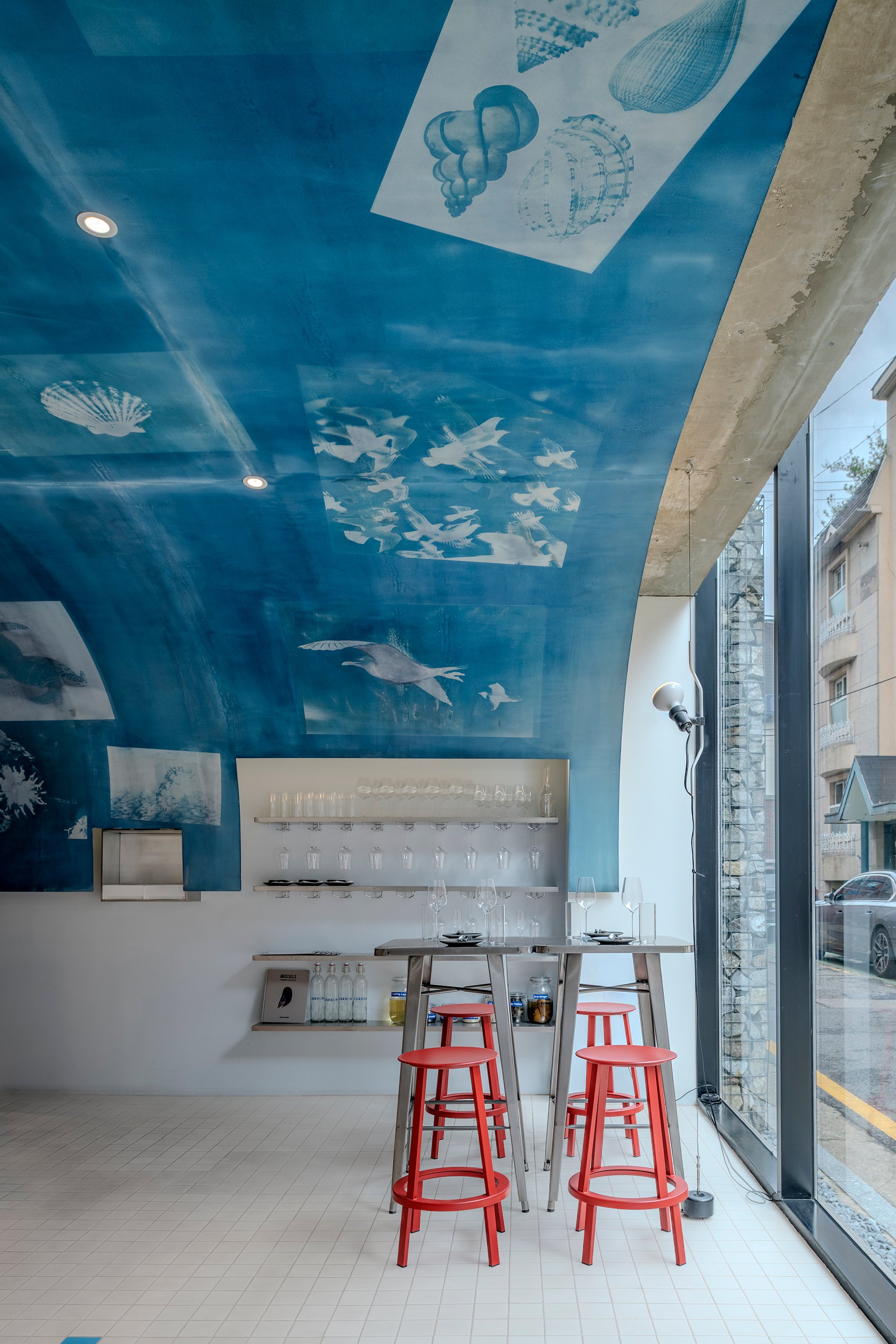
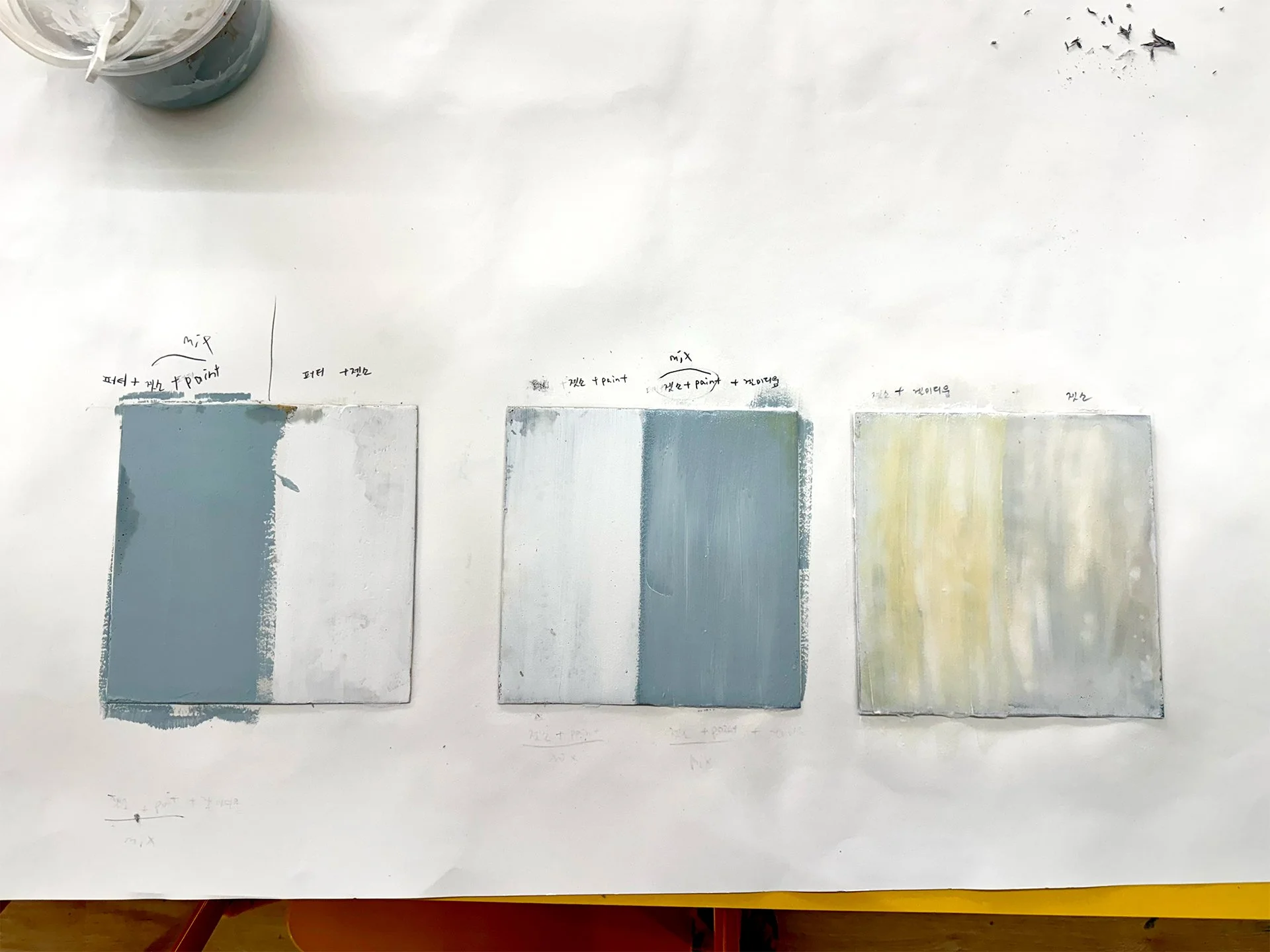
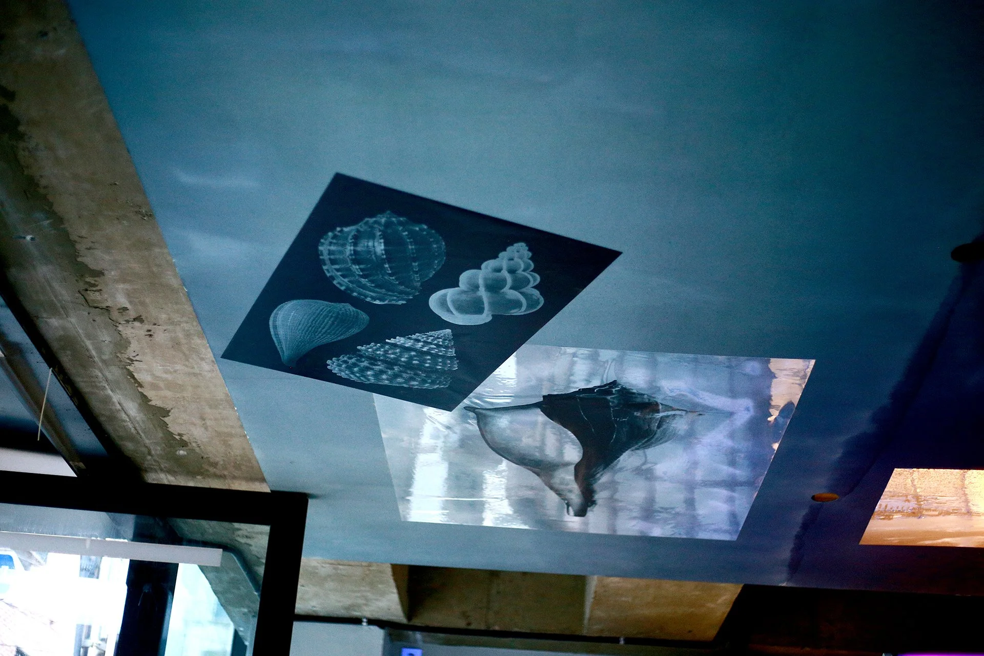
이러한 브랜드의 정체성은 바다의 심연을 은유한 천장 디자인으로 집약됩니다. 빛과 시간에 따라 미묘하게 변주되는 색감은 일렁이는 바다의 표정을 공간 안에 구현하며, 다이닝 전반에 살아 숨 쉬는 듯한 유기적인 생동감을 불어넣습니다.
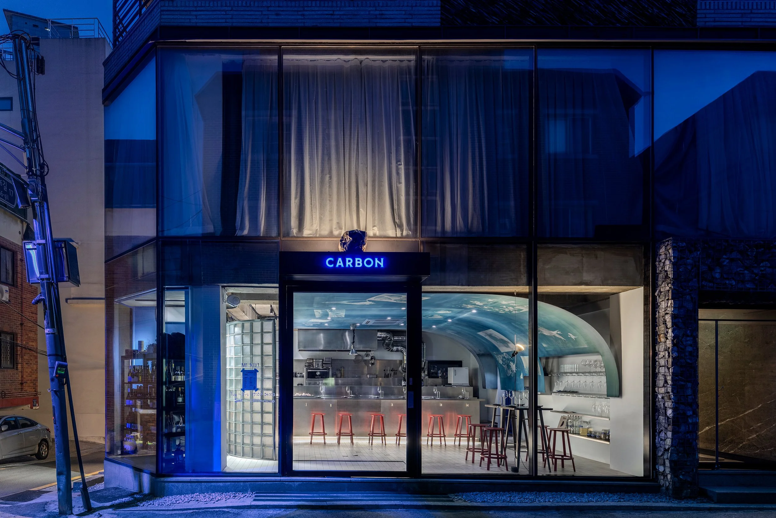
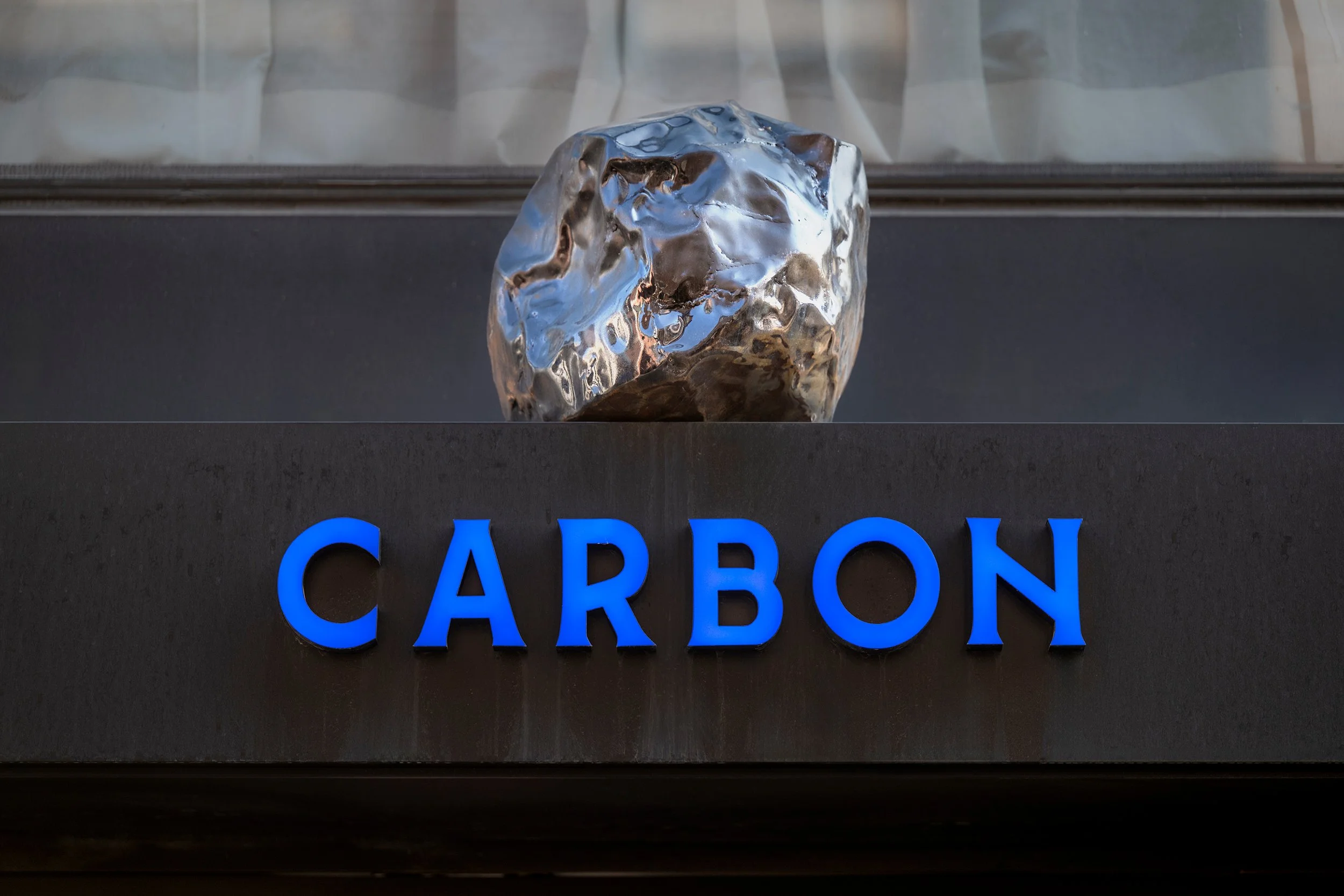
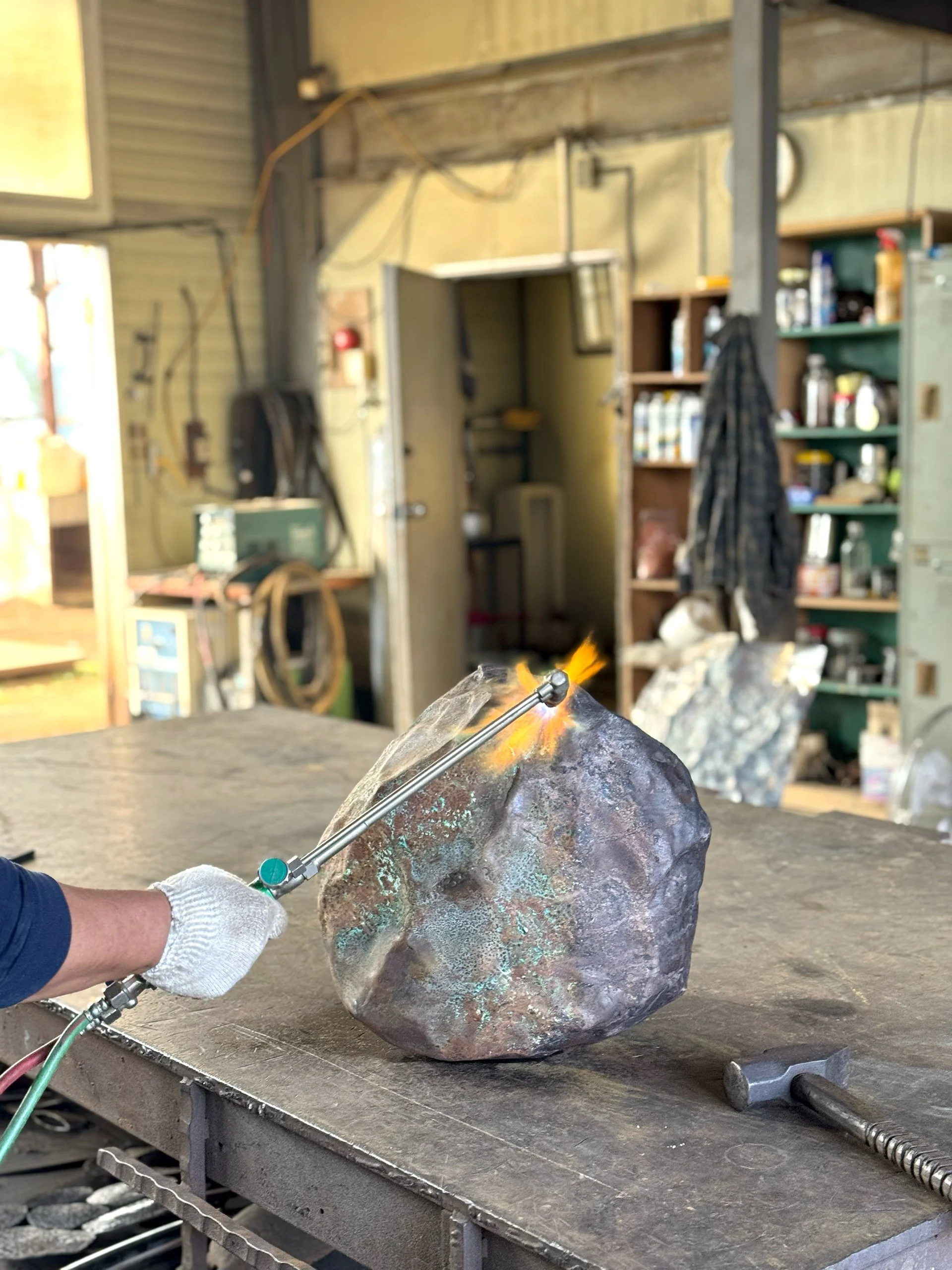
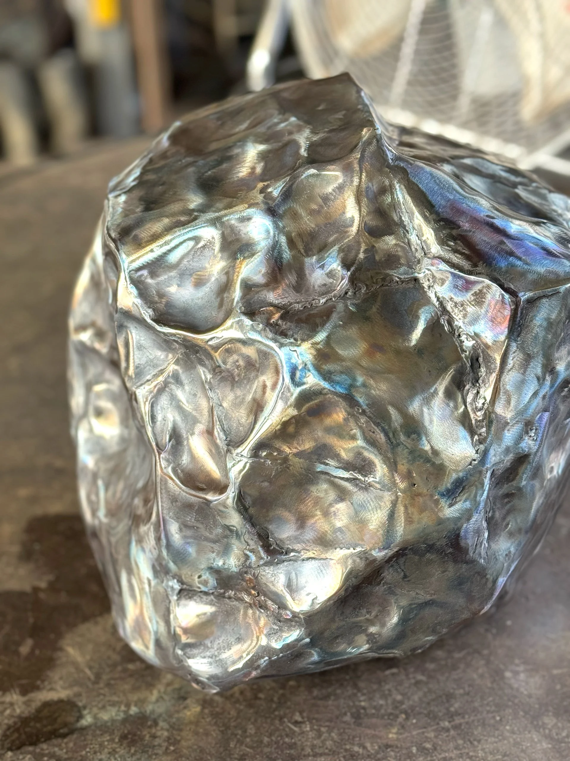
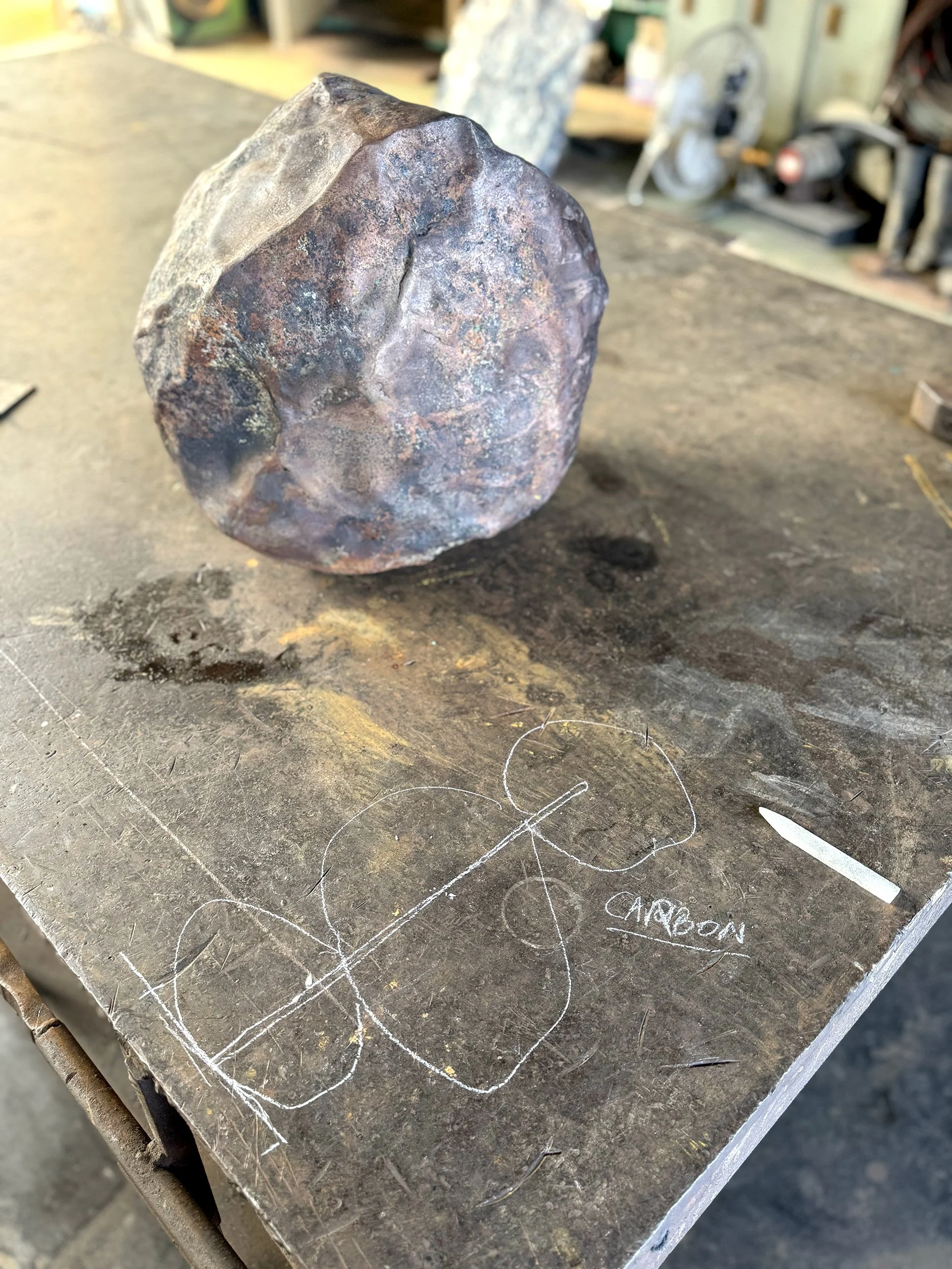
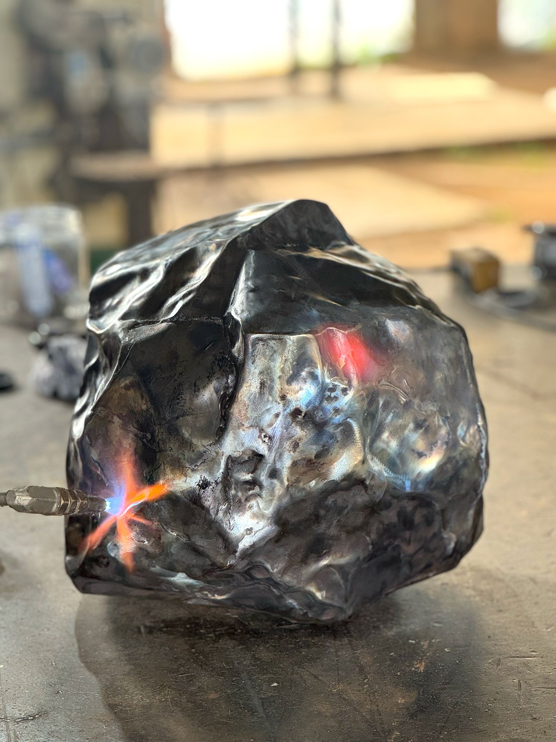
STRUCTURAL SIGNAGE DESIGN / PRODUCTION PROCESS
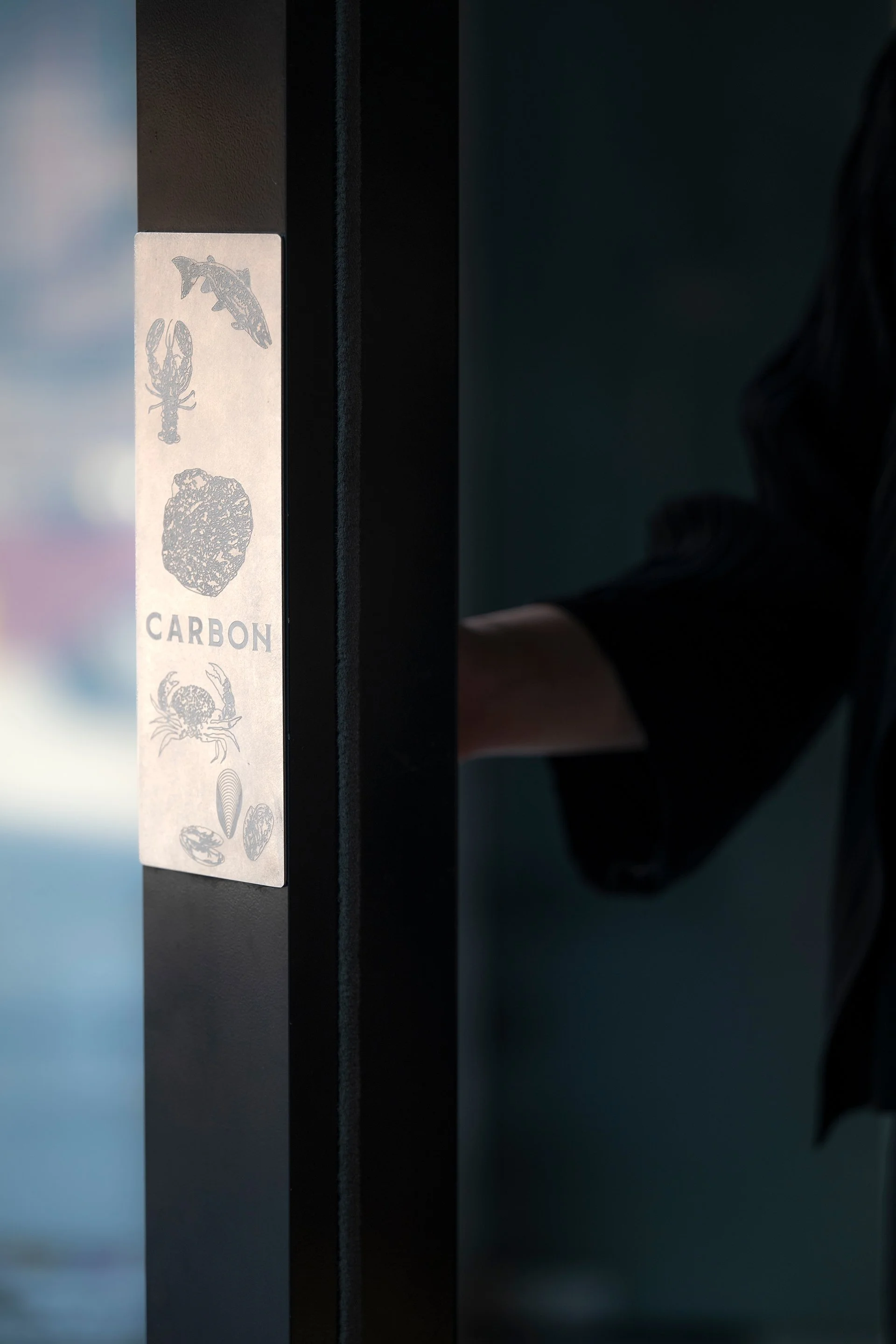
Rooted in the concept of 'Carbon'—the element of life and a symbol of fire—CARBON is a seafood dining destination where the dynamism of the ocean intersects with urban sophistication. The raw, rustic sensibility of a traditional fish market is reinterpreted through a design language of charcoal and blue tones, culminating in a refined, modern aesthetic.
Notably, the brand breaks away from the conventions of traditional seafood dining by declaring a "No Oyster Zone." Replacing the expected oysters with the intense heat of a charcoal oven and the rich flavors of diverse seafood, CARBON offers an urban gastronomic experience elevated by crisp white wines and a curated soundscape.
This brand identity culminates in the ceiling design, a spatial metaphor for the depths of the ocean. The subtle shifts in color, adapting to light and time, recreate the ever-changing surface of the sea, breathing a vibrant, organic vitality into the entire dining space.
CEILING ARTWORK & PAINTING
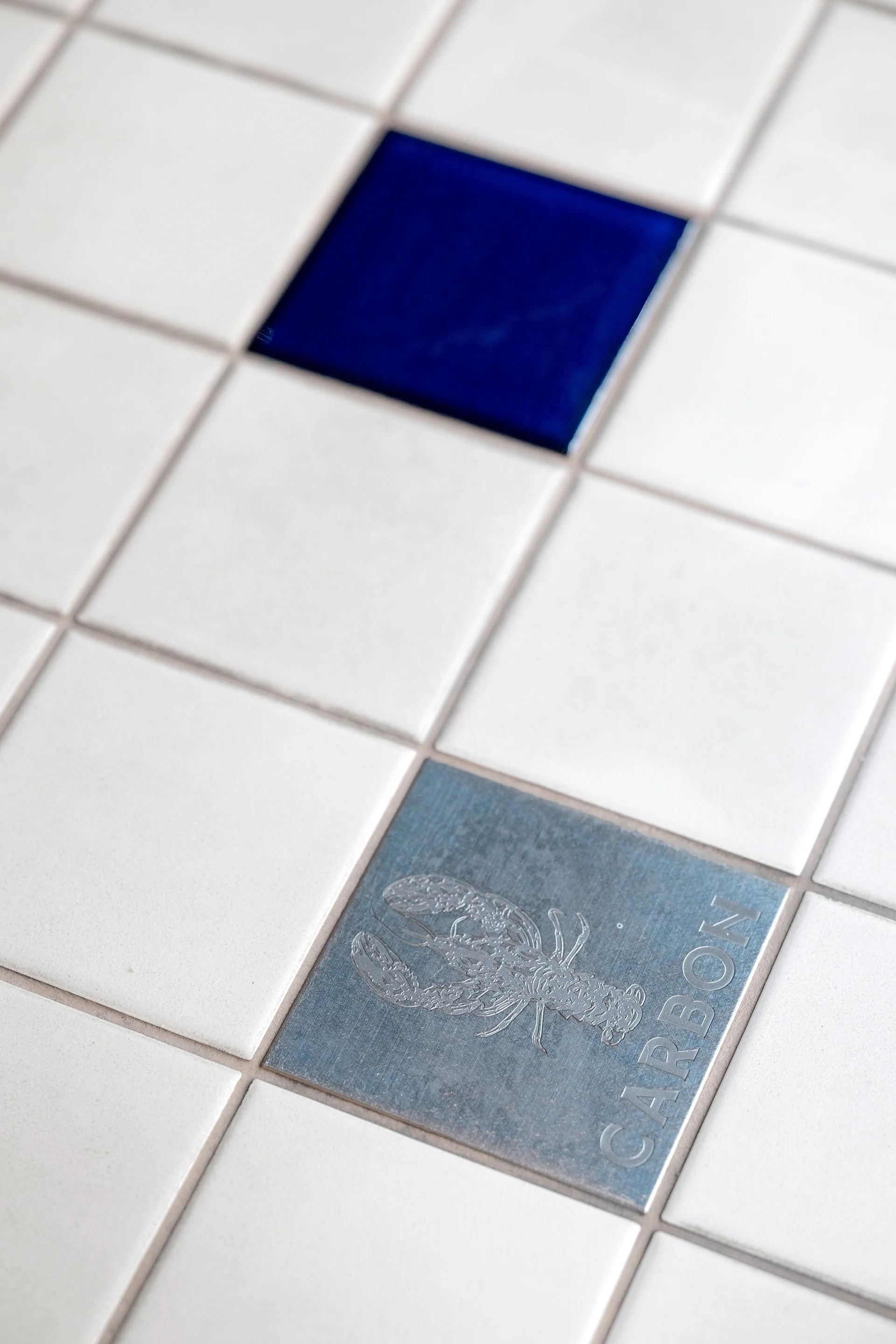
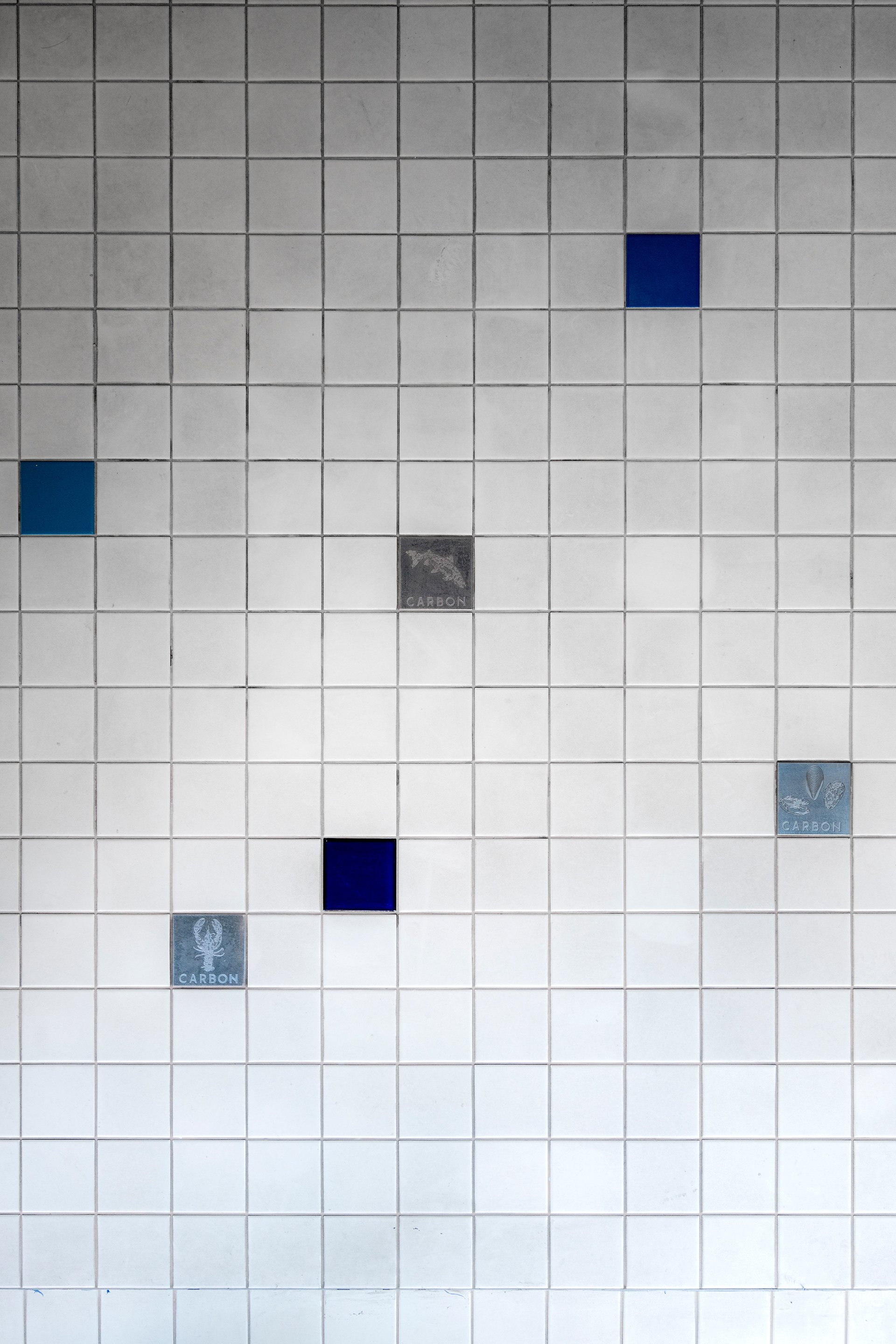
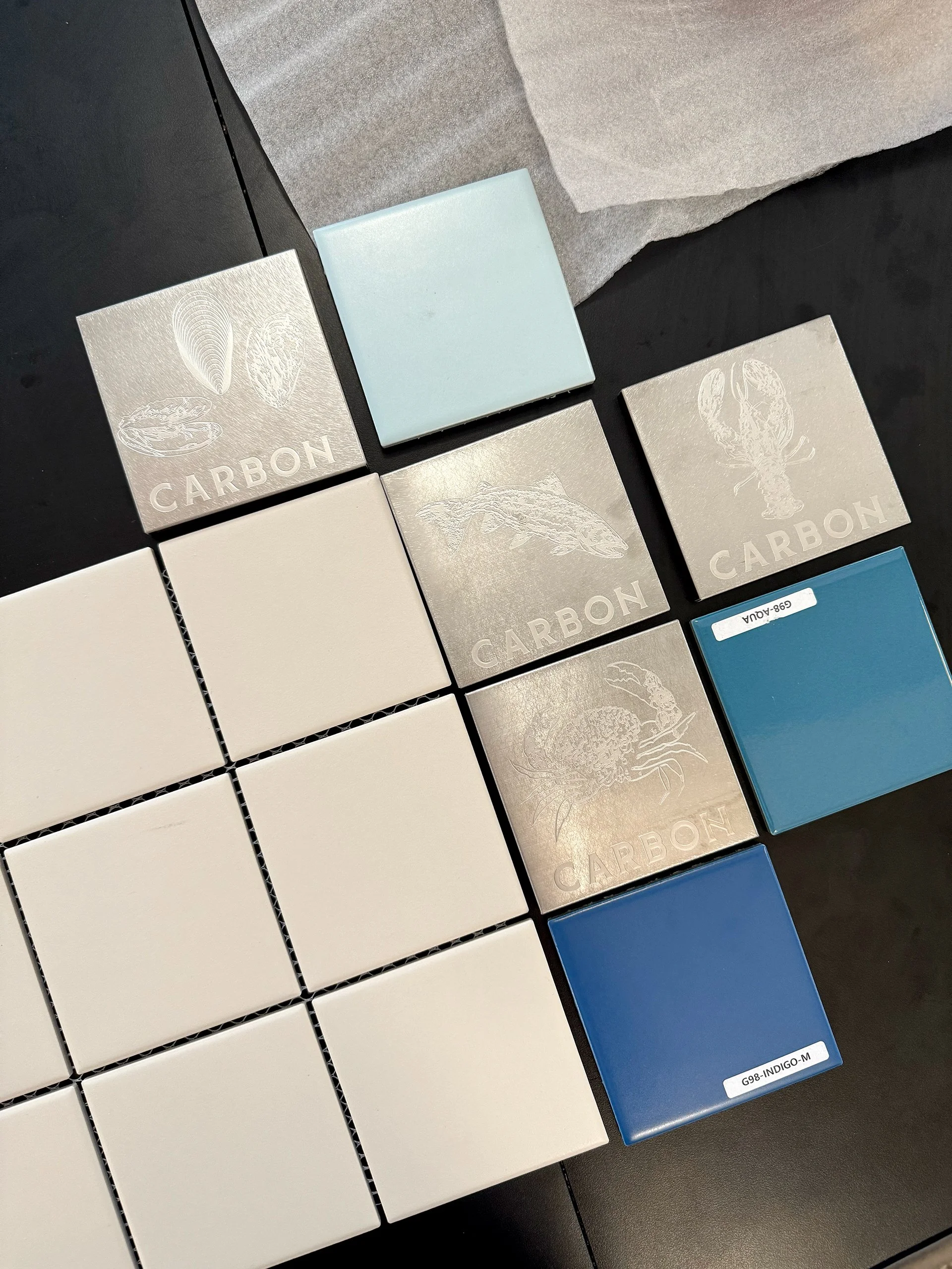
CUSTOM PLATE TILE DESIGN